Category: Uncategorized
Newsletter March 2024
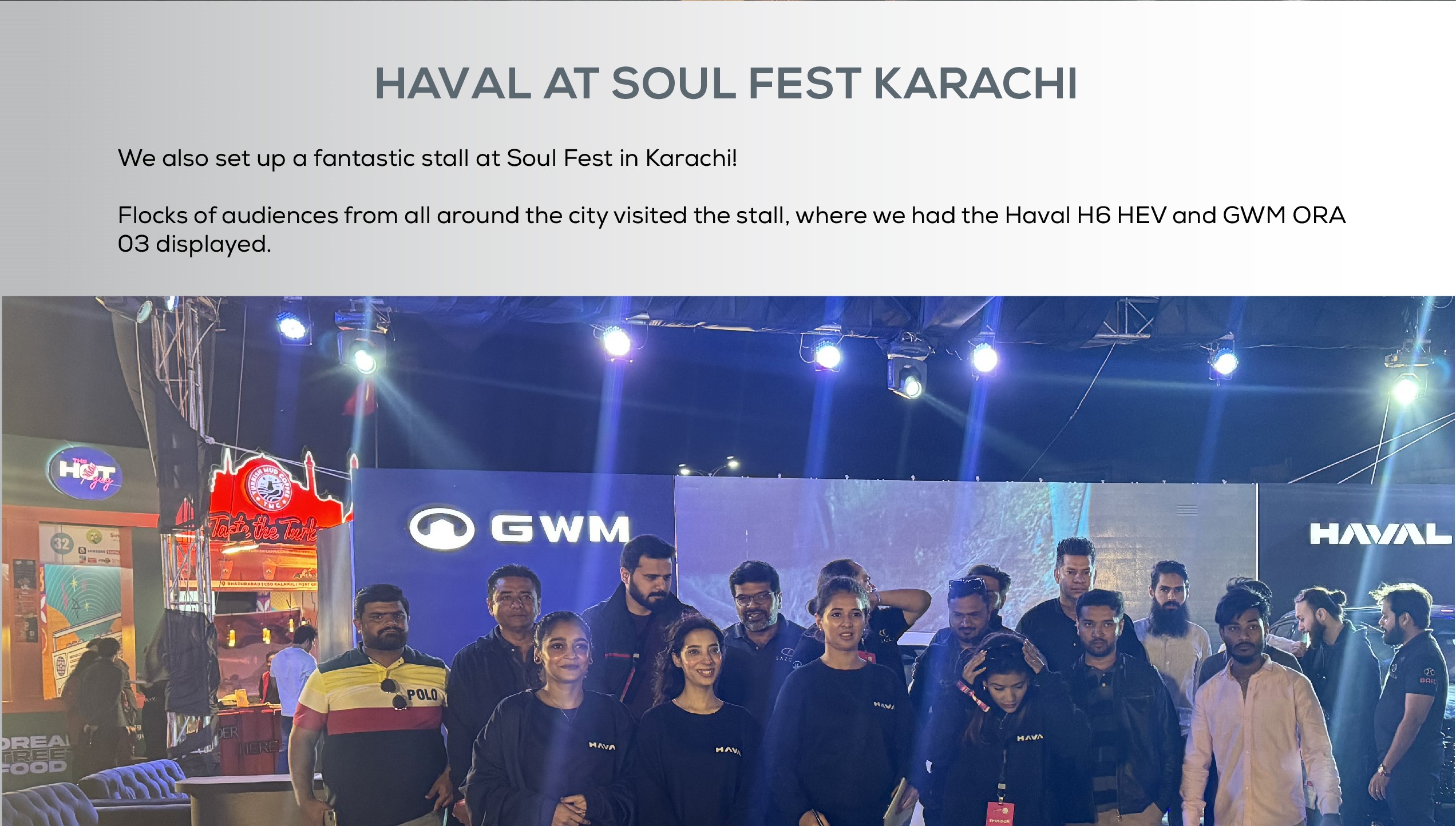
Sazgar recently imported CBU unit of GWM's, a 100% electric vehicle. Customer can now book their own ORA and get deliveries within 3-4 months!

Newsletter February 2024
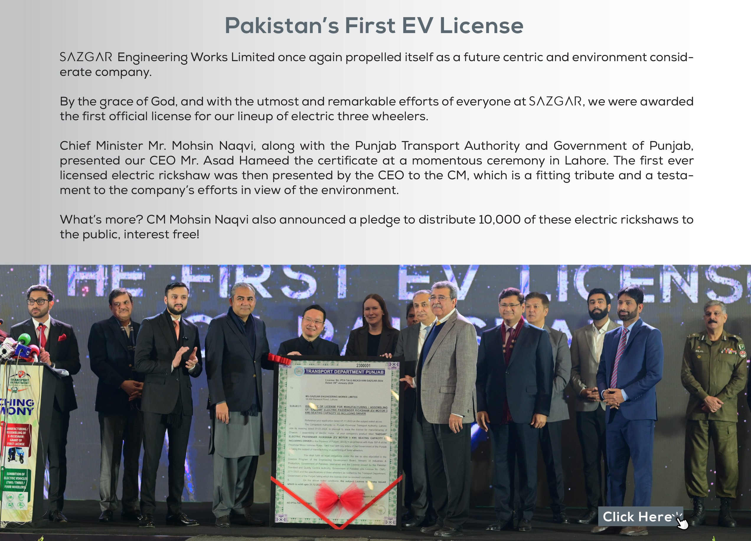
Sazgar Engineering Works Limited one again propelled itself as a future centric and environment considerate company

Newsletter January 2024
Sazgar and Haval reached a remarkable milestone, producing our 3000th vehicle after an incredible journey that begin in November 2024. Achieving this within a mere 13 months is a testament to out team's dedication and expertise

Your First Love – The All New Locally Assembledd
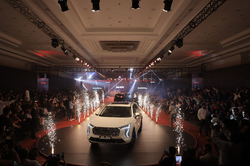
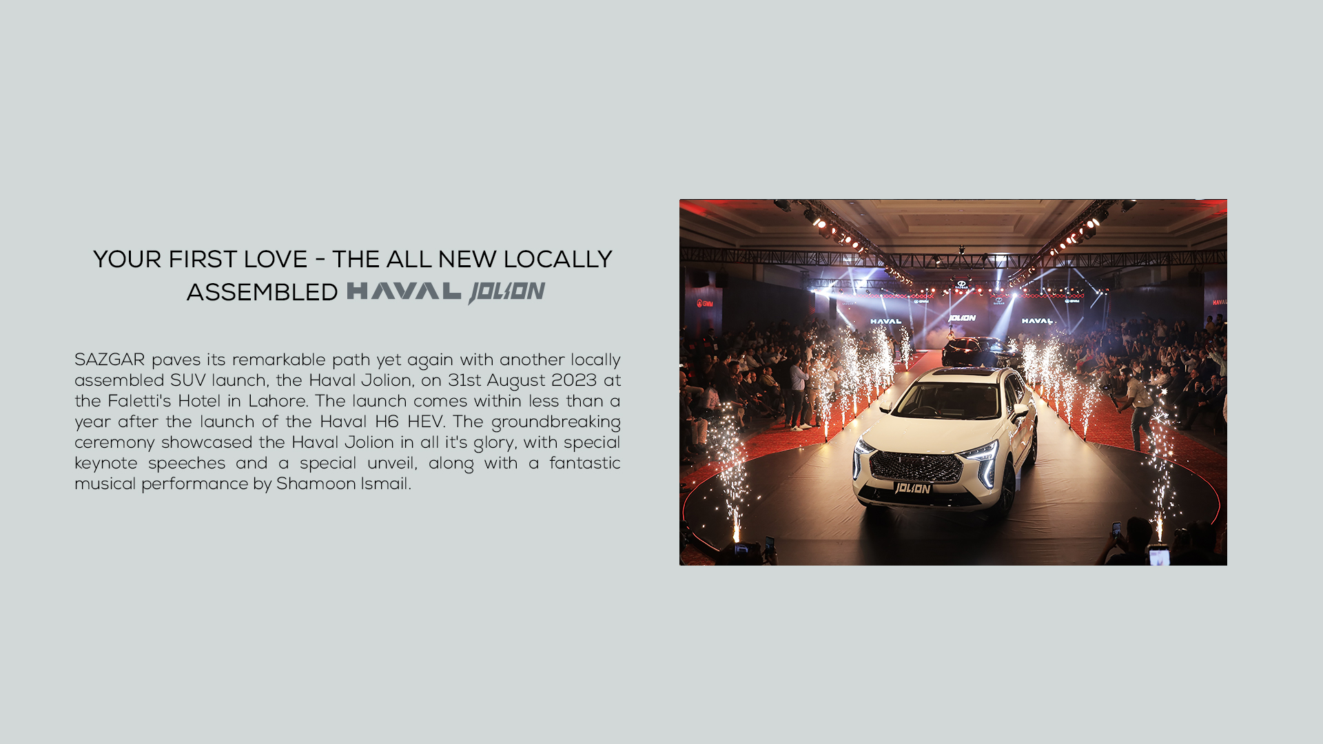
Unveiling of the Haval Jolion: Where Luxury Meets Innovation
[Lahore, 31st Aug, 2023] — The automotive world witnessed a groundbreaking moment as Haval proudly introduced the highly anticipated Jolion, a compact SUV that embodies a perfect blend of style, performance, and cutting-edge technology. This momentous occasion took place at the exclusive launch event under the banner of “Be My Jolion,” celebrating the concept of the first love in the automotive realm.
Jolion, which means ‘First Love,’ goes beyond being a car; it’s an embodiment of elegance and practicality wrapped in a sleek design. With an innovative approach that fused luxury, comfort and convenience, Jolion stood as a testament to Haval’s commitment to providing a superior driving experience. Its bold exterior design exudes confidence. Meanwhile, the spacious and meticulously crafted interior is so impressive that you can’t help but fall in love with it.
Innovative Safety Features
Safety is at the forefront of the Haval Jolion’s design philosophy. This compact SUV is equipped with a comprehensive suite of advanced safety features, including:
Automatic Emergency Braking on straight roads and intersections: The Jolion takes proactive measures to ensure your safety by automatically applying brakes during emergencies on both straight roads and intersections.
Forward Collision Warning System: The Jolion’s sophisticated sensors keep a vigilant eye on the road ahead, warning the driver of potential collisions and allowing them to take corrective action.
Lane Departure Warning System/Lane Departure Assist System: Drivers stay confidently in their lanes with the Jolion’s Lane Departure systems that provides alerts and assists in maintaining the proper lane position.
Blind Spot Warning System: Changing lanes becomes safer and more intuitive with the Jolion’s alerts when cars are present in your blind spots.
Moreover, the Jolion owners can enjoy these features with extended warranty as well, offering 5 years/150,000 km of coverage.
The ‘Be My Jolion’ launch event was a star-studded affair, with everyone in awe of the grandeur of the Haval Jolion. The event was graced by distinguished individuals from various fields. Dr. Gohar Ejaz, Federal Minister for Commerce and Industry, was present to share his insights on the intersection of technology and automotive innovation. Sunil Munj, a visionary leader who had made substantial contributions to automotive industry, was also in attendance, lending his perspective on the Haval Jolion’s impact on the market.
“The Haval Jolion represents a perfect harmony between aesthetics and functionality, redefining the driving experience,” said Ali Hameed, COO at Haval. ” Pakistan market is a significant part in Great Wall Motor global strategy. We will continue to provide with more excellent products, including EV and PHEV. We will work together with Sazgar for a win-win development and support the Pakistan market to achieve a great success in the future,’’ Said Mr Parker Shi, the Head of Great Wall Motor.
As the automotive world geared up for the unveiling of the Haval Jolion, the “Be My Jolion” event stood as a testament to innovation, luxury, and sheer magnificence. Everyone couldn’t help but wonder, could this #BeMyJolion?”
About Haval:
Haval is a global automotive brand dedicated to pushing the boundaries of innovation, design, and performance. With a commitment to excellence, Haval continues to redefine the driving experience by introducing vehicles that inspired and elevated. The Haval Jolion is a testament to this commitment, embodying the perfect synergy of style, performance, and technology.
INTRODUCING SAZGAR’s MONTHLY NEWSLETTER

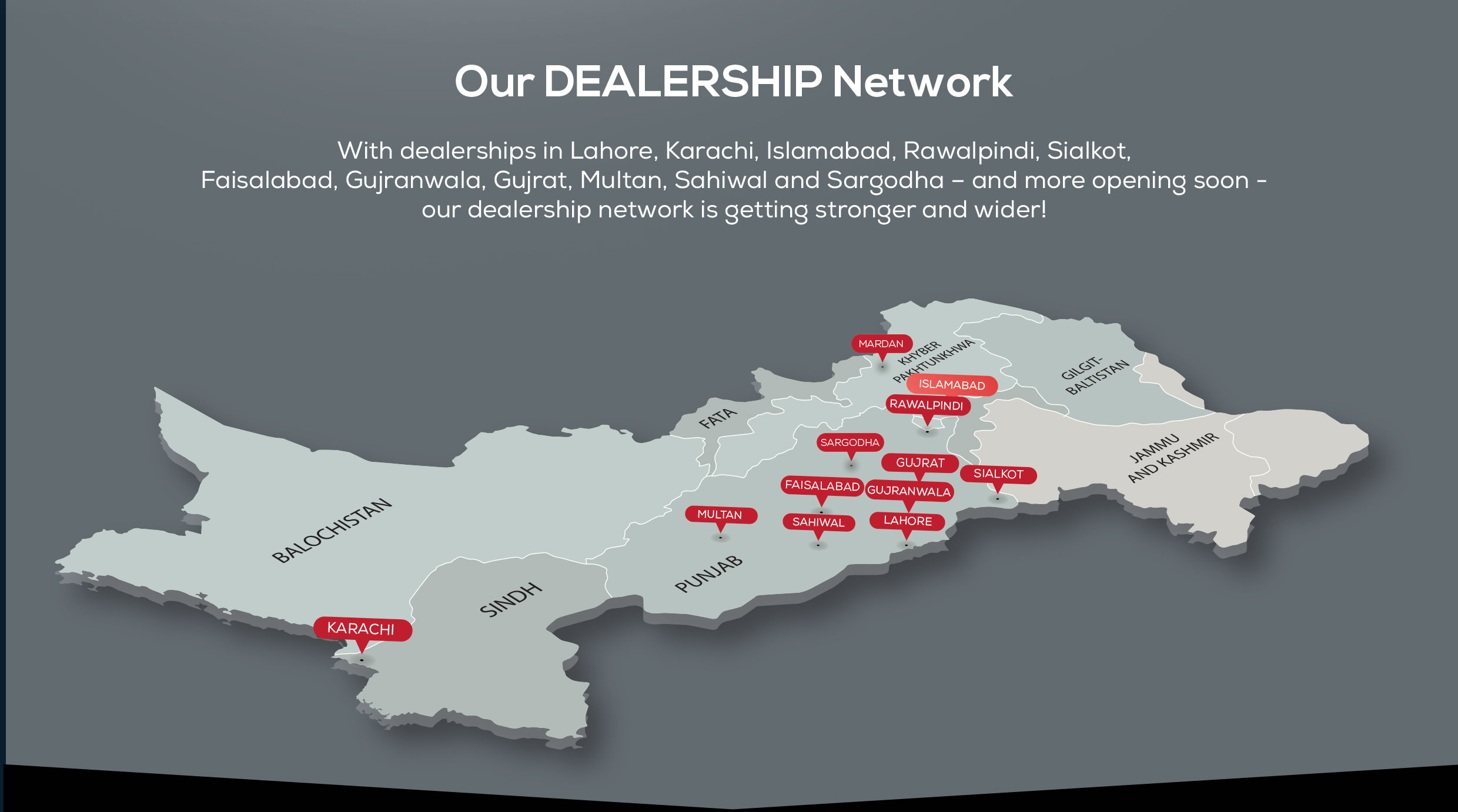
Our First Company operated in the twin cities, called THE GREAT WALL MOTORS, is now open!
Our First Company operated in the twin cities, called THE GREAT WALL MOTORS, is now open!




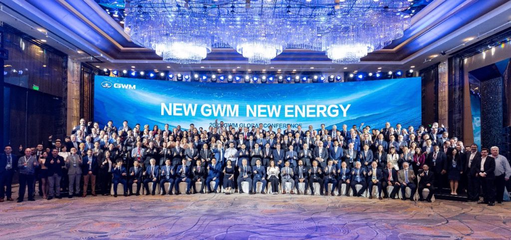
GWM Holds 2023 Global Conference with Partners in Shanghai


GWM Holds 2023 Global Conference with Partners
On April 19, GWM held the 2023 Global Conference with the theme of “NEW GWM NEW ENERGY”, attended by more than 260 distributor representatives from more than 60 countries and regions
Mu Feng, President of GWM, gave a detailed introduction to the participants on GWM’s global expansion, Forest Ecosystem, and future new energy strategic planning.
Mu Feng said that GWM has issued a declaration on new energy to the world, that is, GWM Intelligent NEV, Greener, Higher, Safer. In the future, based on the Forest Ecosystem, GWM will adopt the “ONE GWM” model and global big single product strategy to carry out targeted differentiated planning in the global market and cooperate with global partners to create more high-quality new energy products for customers.
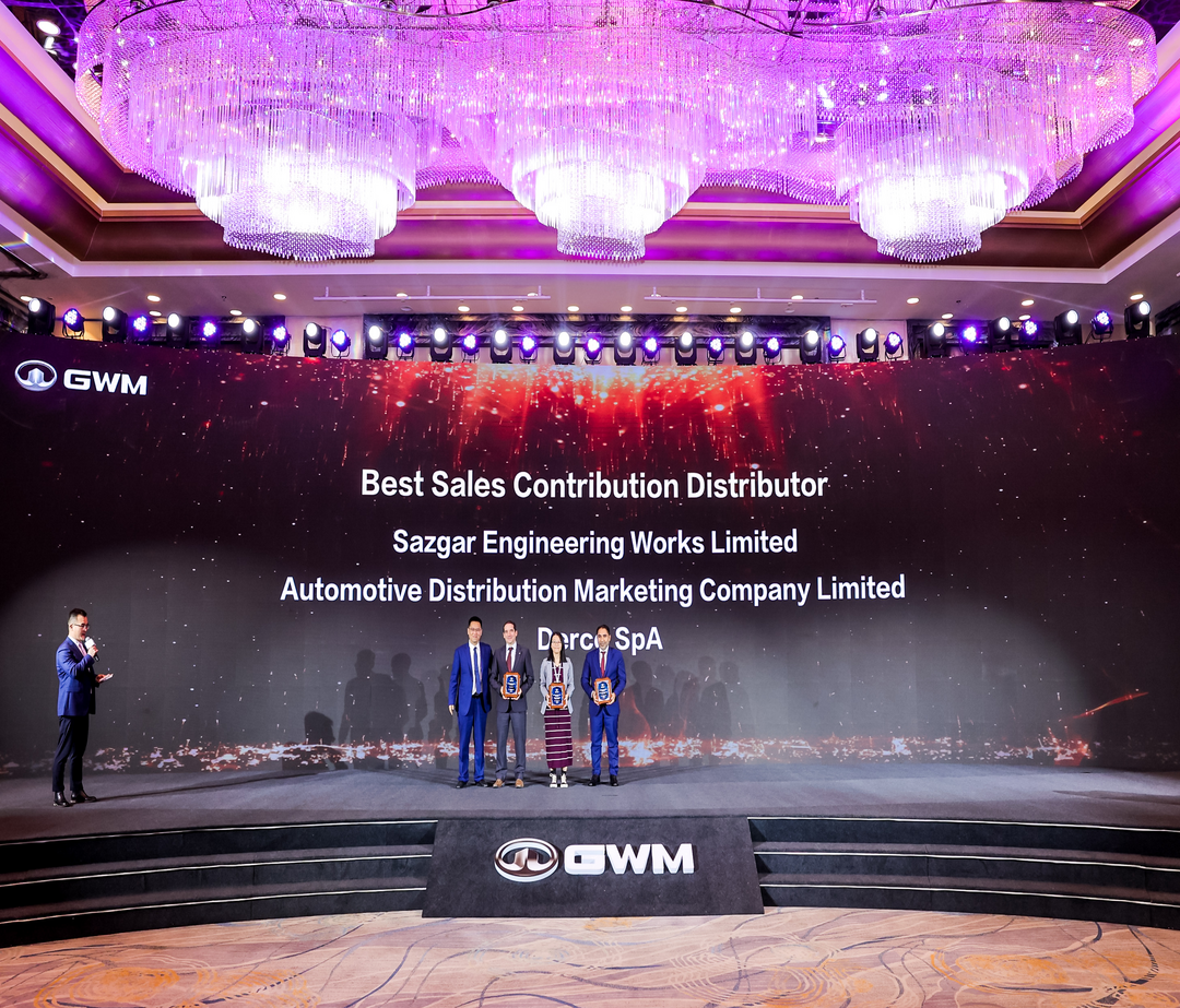
At the conference, GWM held a grand award ceremony to commend distributors who worked with GWM to expand the market. Parker Shi, the Vice President and the Head of international market of GWM, awarded honorary awards to distributor partners who have made outstanding achievements. Before the ceremony, GWM also held the Global Business Partner Signing Ceremony and established partnerships with dozens of new distributors from global markets.
GWM also invited hundreds of distributor representatives to visit the factory and R&D laboratory on the eve of the conference and attend GWM’s press conference in Auto Shanghai, which gives distributors a more comprehensive understanding of the Forest Ecosystem. Distributors expressed their recognition of GWM’s great vehicle manufacturing strength and intelligent new energy products.
A new distributor partner said, “The visit to GWM has given me an experience of its excellent new energy solutions and I hope to bring new energy vehicles to more local customers as soon as possible.”
Distributors from Australia, South Africa, and Brazil are optimistic about the future market performance of GWM. Distributor representatives believe that GWM’s excellent quality, luxury features, and new energy advantages are recognized by consumers and it is gaining a good reputation. Cooperation with GWM will be an important step towards a better future.
Currently, GWM is continuously expanding its global sales and market layout. In 2022, the overseas sales volume of GWM exceeded 170,000 units, with a year-on-year increase of 21.28%, hitting a record high. Since its export in 1997, GWM has had more than 700 overseas sales channels covering more than 170 countries and regions around the world, with a total sales of more than one million vehicles.
In the future, GWM will promote the overseas implementation of the whole industrial chain including products, technologies, and services. GWM also expects to strengthen the Forest Ecosystem to achieve a win-win result for all and jointly promote the transformation of GWM’s global new energy strategy with global distributor partners.
Revamping the HAVAL Logo: A Brand Built on Innovation, Style, and a Bold New Look

Revamping the HAVAL Logo: A Brand Built on Innovation, Style, and a Bold New Look

HAVAL is an SUV manufacturer that has made a name for itself in the global automobile market over the past decade. The company is a subsidiary of Great Wall Motors, which was established in 1984 and is the largest SUV and pickup manufacturer in the world’s largest market. HAVAL has built its reputation on producing high-quality SUVs and crossovers that are known for their stylish design, comfort, and performance. The brand has held the number one SUV manufacturer position for 13 consecutive years and has been at the top of the pickups category for 25 years.
The HAVAL logo has undergone several changes since the company’s inception, reflecting the brand’s growth and the evolution of its products. The earliest versions of the logo featured a more elaborate design, with a red and gold color scheme that included a dragon emblem. This design was intended to appeal to the Chinese market, where dragons are considered symbols of power and prosperity. However, as the company expanded its global reach, it became clear that the logo needed to be simplified and modernized.

In keeping with its pledge to foster innovation and advancement, HAVAL, the renowned global automotive manufacturer, has recently undergone a comprehensive revamp of its brand logo. The renewed logo is based on the concept of “new energy”. The logo design draws inspiration from the ancient Chinese concept of “Mortise and Tenon,” which symbolizes the integration of man and nature, craftsmanship, and ancient scientific and technological wisdom. The updated HAVAL logo represents a significant departure from its predecessor, featuring a sleeker, flatter, and more intelligent design.
The new HAVAL logo is a symbol of the brand’s values and aspirations in the new energy era. It represents HAVAL’s commitment to infinite exploration and technological innovation, as the brand embraces and leads the way forward with an open attitude and innovative technologies, products, and services. The logo also represents the brand’s commitment to safety, stability, and reliability. The solid, sturdy design of the logo reflects HAVAL’s focus on producing high-quality vehicles that customers can rely on. In addition, the modular construction of the logo signifies the diverse range of vehicles that the brand produces. The logo also symbolizes that the HAVAL brand is built upon the innovative L.E.M.O.N. Platform and encompasses a range of model categories tailored to cater to diverse consumer lifestyles and application scenarios.

Overall, the new HAVAL logo is a powerful representation of the brand’s values, aspirations, and commitment to the future, with its focus on innovation, safety, reliability, and customer-centric design, the HAVAL brand is poised to continue its growth and success in the new energy era and beyond. The revitalized HAVAL logo embodies the brand’s relentless pursuit of exploration and development, showcasing the company’s unwavering dedication to innovation and style in every aspect of its design, from the streamlined exterior of its vehicles to the cutting-edge features and technology integrated within.
In conclusion, the renewed HAVAL logo reflects the company’s innovation, style, and continuous development values with its sleek, flat design and a sense of time-space integration, the new HAVAL logo is a symbol of the brand’s commitment to excellence and progress, and it is sure to become an iconic representation of the company’s legacy.
Tech-Driven Safety: GWM HAVAL JOLION, WEY Coffee 01, ORA FUNKY CAT


Improving Safety Performance with technology, GWM HAVAL JOLION, WEY Coffee 01 and ORA FUNKY CAT Awarded Five-star Safety Ratings


Recently, three of GWM’s models, HAVAL JOLION, WEY Coffee 01 and ORA FUNKY CAT (also known as the GOOD CAT) have secured five-star ratings from the Australasian New Car Assessment Program (ANCAP) and the European New Car Assessment Programme (Euro NCAP) respectively. On September 19, HAVAL JOLION was recognized in the five-star rating of ANCAP in the Australian market. This is the fourth model from GWM to receive this rating in this market in the last 12 months.
According to the test results released by ANCAP, HAVAL JOLION achieved excellent scores in all tests, including those for ADULT OCCUPANT PROTECTION, CHILD OCCUPANT PROTECTION, VULNERABLE ROAD USER PROTECTION and SAFETY ASSIST, with scoring rates of 90%, 84%, 64% and 92% respectively. These excellent performances are inseparable from the model’s multiple intelligent configurations. HAVAL JOLION is equipped with multiple active safety configurations (AEB, ACC, ELK, etc.) as standard in the Australian Market. And among the SAFETY ASSIST test, Lane Support Systems (LSS) got full marks.
The results achieved by WEY Coffee 01 and ORA FUNKY CAT were also remarkable in safety tests in the European market. In early September this year, the two models received five-star ratings from Euro NCAP. Particularly, according to the report released by the Euro NCAP that the WEY Coffee 01 achieved a scoring rate of 94% on the SAFETY ASSIST test. In the protection tests of adults, children and vulnerable road users, the model was rated 91%, 87% and 79% respectively.
The final test result also showed that the overall rating of WEY Coffee 01 ranked third in this test, which is higher than the Mercedes-Benz C-Class and Volvo C40 Recharge. Michiel van Ratingen, Secretary General of Euro NCAP said, “this year, Euro NCAP will test more Chinese cars than it has ever done and Great Wall (GWM) really sets the standard for others to follow.”
GWM has always attached importance to driving safety since its establishment, with continuous investment in R&D relevant to that. NOH (Navigation on HI Pilot) intelligent pilot assisted driving system, self-developed by GWM, has been upgrading constantly.
